 English
  German
  Spanish
  Italian
  French
  Danish
  Portuguese
  Swedish
  Polish
  Korean
  Japanese
 Getting Started #
Display navigation links in your WordPress websites with Elementor Breadcrumbs Widget. Here’s a comprehensive article to explain every method in detail. Follow the step-by-step process to connect the Breadcrumb.
Add Breadcrumb Widget #
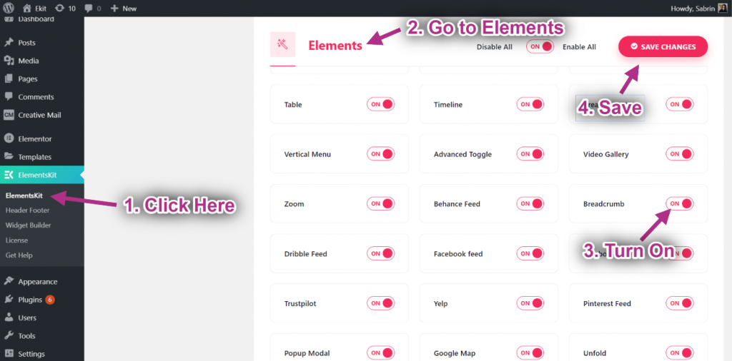
- Step=>1: Go to Elementskit-> Elements-> Make sure that your Breadcrumb is Active-> Save
- Step=>2: Go to Elementor=> Search Breadcrumb=> Just Drag and drop the field.
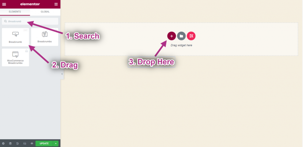
- Now you can see your Breadcrumb widget.
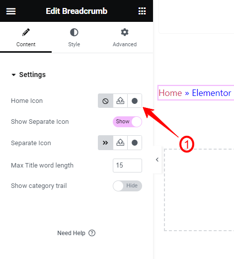
- Step=>3: Now, enter the Content Tab from the widget settings. Here, you will find the following settings:
Settings, #
- Home Icon– You can add a home icon for the breadcrumbs. You will see three different options:
- Click this one for not showing any home icon.
- The next one lets you upload an SVG icon from your device.
- And, clicking the third option will open up a popup with the icon library.
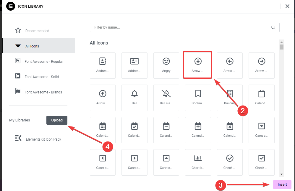
- Select an icon and hit the “Insert” button.
- Show Separator Icon: This toggle button is enabled by default. Disable this button if you do not want to show a separator between paths.
- Separator Icon: From here, you can change the default separator icon and add a new one from the icon library. There’s also an option to upload an SVG icon. It works in the same way like “Home Icon”.
- Max Title Word Length: Define the maximum word length of the page or post title.
- Show Category Trail:
Customize Breadcrumbs Widget #
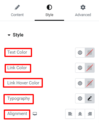
Now, we’ll explore the customization options for the breadcrumb widget. Head to the Style Tab.
Style, #

- Text Color: Set a color to the breadcrumb step where users are currently active.
- Link Color: Add a different color to link-embedded text.
- Link Hover Color: Give color to the link-embedded text on the hover state.
- Typography: Control all the factors within typography like font, size, color, line height, word spacing, etc.
- Alignments: Set the positioning of the breadcrumb to the left, right, or center.
Breadcrumb, #
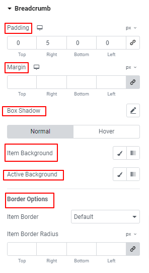
- Padding: Adjust the spacing between breadcrumb items and add additional space with the element border.
- Margin: Set space surrounding the breadcrumb items.
- Box Shadow: Set the shadow effect around the breadcrumbs.
- Item Background: Give a background type between solid color and gradient for an item.
- Active Background: Add background color to an active background item.
- Border Options: Use these controls to adjust the border width, color, style, and roundness of the border.
Icon, #
Home Icon, #
- Color: Use the color picker to set the color for the home icon.
- Space Between: Use the slider or enter a custom value to define the gap between the home icon and text.
- Size: Set the size of the breadcrumb home icon.
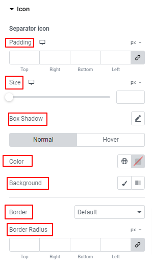
Separator Icon, #
- Padding: Set the spacing between breadcrumb text and separator icons.
- Size: Determine the size of the separator icon by using the slider or entering a custom value in the field.
- Box Shadow: Use these controls to add shadow effects around the breadcrumb’s item border.
- Color: Choose a color for the separator icon.
- Background: Add a solid color or gradient background to the separator icon.
- Border Settings: Get all the features like adding border color, selecting border style, defining border thickness, etc to customize the border.
That’s it! Now, its your turn. Add a beautiful breadcrumb to your Elementor website.


